

I recently received a postcard from Adrianne Lobel about her upcoming Reflections on a Pond exhibition, this will be her fourth show at the Bowery Gallery Bowery Gallery April 25 – May 20. I was intrigued by her unique approach to geometric abstraction and color arrangements and decided to find out more. I then recalled that I’d seen her 2018 Bowery Gallery show online of plein air-based mobile home series; looking closer, I guessed that these new abstractions also had their genesis from observation on some level. I decided to ask if she’d consider an interview and was very pleased that she accepted my invitation to talk about her process and background in this email-based interview.
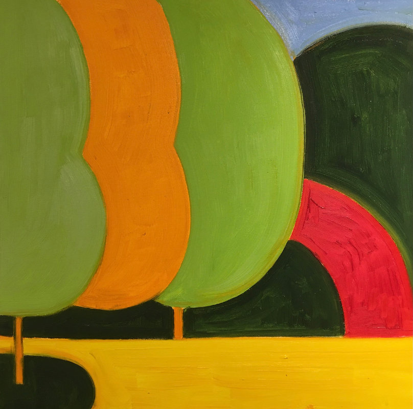
Autumn Pond, 36×36 inches, oil
Her press release for this show states:
Adrianne Lobel presents a new series of graphic and geometric paintings inspired by the landscape and its reflection on her pond in upstate New York. Over the years, her work has become more and more abstract. She tries to compose the chaos of nature into something almost architectural.
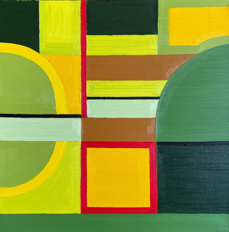
“Adrianne Lobel takes on the classic challenge of abstraction as she distills her experience of nature with carefully honed shapes. Varying color harmonies, lushly painted, signal the change of seasons and the time of day. Powerfully composed arrangements bring a tautness of design and a sense of resolution in their clarity. The artist uses great invention to achieve endless and subtle variation using only rectangles along with a few semi-circles and half-circles. Elements overlap, interlock, find themselves sliced by dark lines. The edges are painted freehand, endowing the work with a warmth and accessibility that a more mechanical approach would lack. The resulting paintings are immensely satisfying. The rich density of deciduous forest, sharp blue skies, reflective ponds, the resplendent color of nature are all packed into these simple squares of painted canvas.” – John A. Parks, painter, teacher, and art writer
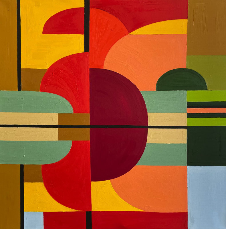
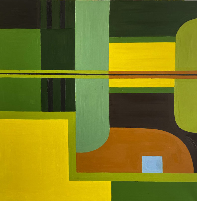
Moon Reflected, 48×48 inches, oil
Larry Groff: In your upcoming exhibition of new work titled Reflections on a Pond at the Bowery Gallery are a series of abstract paintings and tapestries. Is this work based on studies done on-site as you made in previous work, such as your previous series of Mobile Homes?
Adrianne Lobel: Absolutely, The show is called Reflections on a Pond because I spent last summer and fall painting exactly that. I have an old stone house on a hill in Rhinebeck, New York. At the base of the hill is a rather large pond full of frogs and koi. I had a number of areas cleared of cattails and shrubbery so that I could drive my paint-mobile down there with all of my equipment and paint. From the first day, I knew it was going to be exciting. The shapes and colors of the “real” foliage were reflected and distorted in the brown water giving an almost mirror effect and allowing for very interesting compositions. But also–the title has a double meaning as in “Thoughts” of a Pond.
LG: Your father was a well-known successful illustrator and writer of the acclaimed children’s books–the Frog and Toad series. Your mother attended Pratt and was also involved in the Arts and the Theatre. What were some ways your experience as a child led you on your creative path?
Adrianne Lobel: I have been an artist since I was two. My parents both worked at home and often didn’t have time for little me–so they threw me in a corner with crayons, markers, and paper to keep me occupied. Then everybody worked. It was fine with me. Since I can remember, my parents have been freelance artists, so that was normal for me. My work ethic, which is ironclad, comes from watching them get up every day and go to their drawing tables.
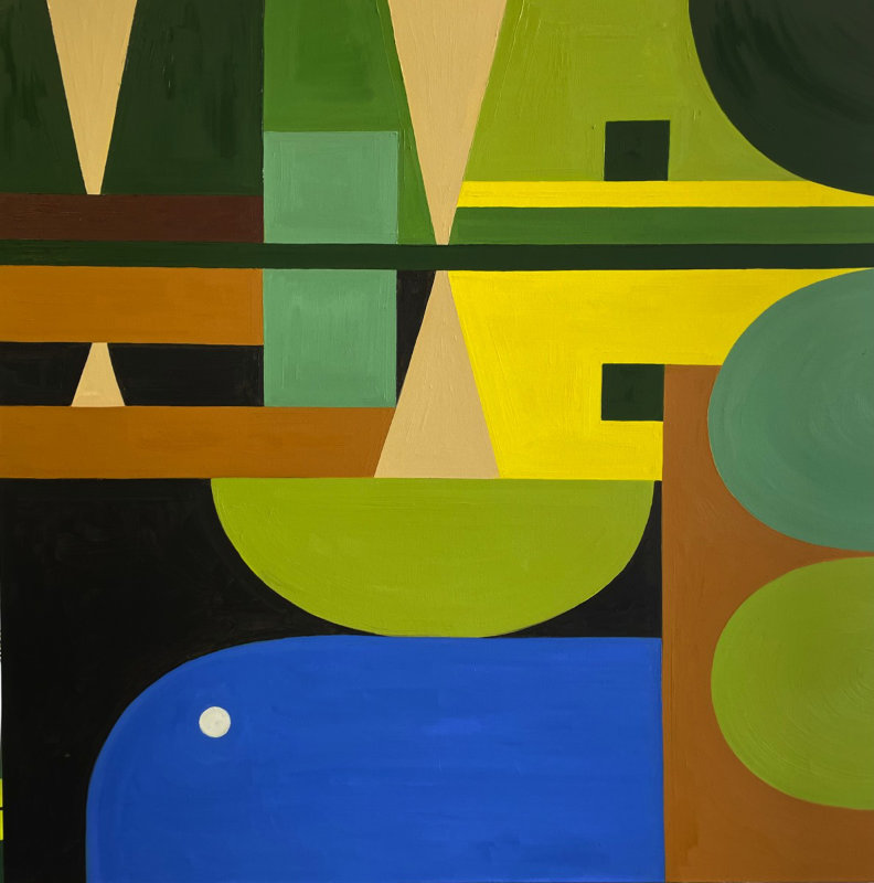
Pond Reflection #1, 48×48 inches, oil
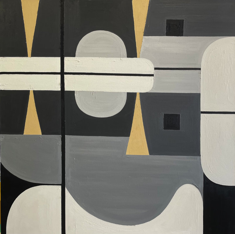
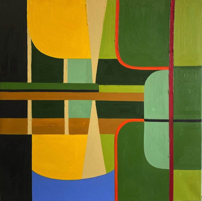
Black and White and Beige, 36×36 inches, oil
Pond Reflection #3, 36×36 inches, oil
LG: From what I’ve read, you grew up in Park Slope, Brooklyn, near the Brooklyn Museum, where you took a number of courses as a young person and considered yourself a fairly serious painter. You later found work as a draftsperson at film studios and got your MFA at the Yale Drama School. What led you to the theatre arts instead of painting?
Adrianne Lobel: I did study painting at the Brooklyn Museum School (sadly gone), but I also worked in summer theaters as a teen. I was much more interested in what went on backstage. I was 15 when I designed and painted my first drop, and I was thrilled with the scale and importance of that. I also loved the social aspect of the theater. At that age, the thought of being a lonely easel painter was less appealing than the party that was going on in the theater. I also thought that working in the theater would lead to actually making a living. (Ha!).

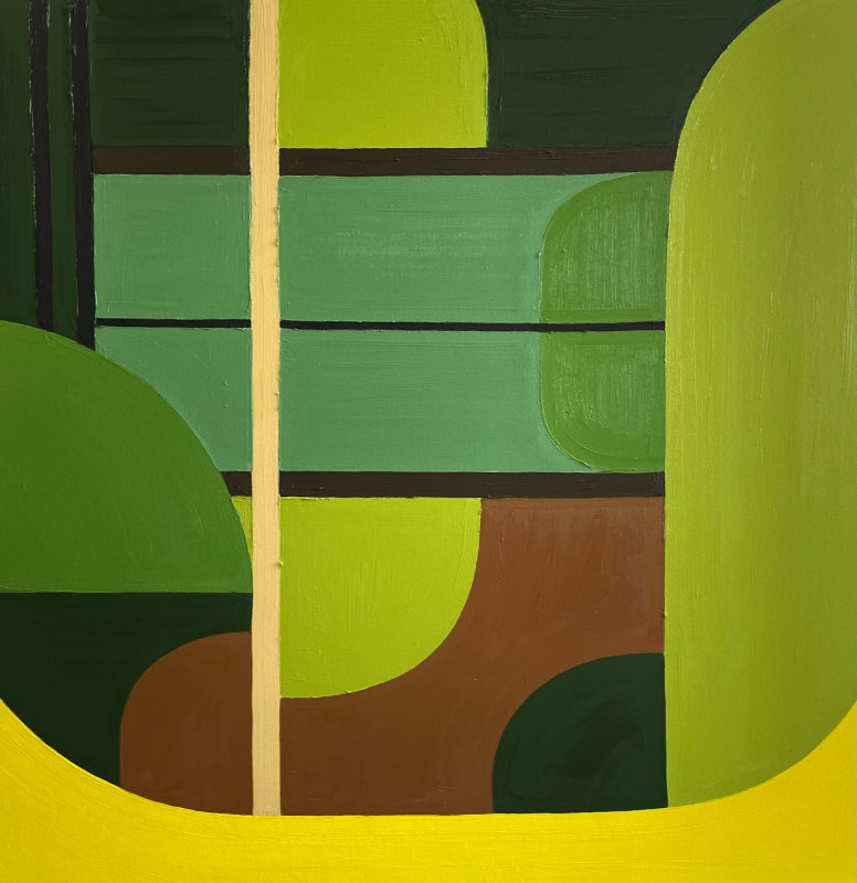
Fall Reflections, 36×36 inches, oil
LG: For over 30 years, you had a successful career in scenic design, starting from working closely with such acclaimed artists as the choreographer Mark Morris and the theatre and opera director Peter Sellars. In 1986 you worked on the opera Nixon in China and then went on to design many of the sets for Mark Morris, such as L’Allegro, The Hard Nut, and Acis and Galatea. You’ve also won the Obie, the Lucille Lortel, The Jefferson, and the Long Wharf’s prestigious Murphy Award. I’m curious to hear whatever you might have to say about why and how you decided to segue from this incredible career to being a full-time painter.
Adrianne Lobel: A lot of things happened. First off, My now ex-husband and I bought the upstate house around 22 years ago. I had been hankering to paint again, and the landscape inspired me–so in the first summers up there, I started to paint en plein air, as I had done as a kid. Then I had a baby, and the travel involved with my brilliant career started to be irksome to me. There was one time when I was working for The Bolshoi Ballet (which was a surreal experience) when my daughter was four. The piece was a ballet choreographed by Christopher Wheeldon. It was 29 minutes long, and it ran in repertory with many other shows–so–it was only onstage for lighting and tech for about half an hour a week–which meant that I had to commute to Moscow three times in three weeks! Every time I said goodbye to my child and got on the 11-hour Aeroflot flight, I thought I would never see her again. It really was too much for me!
LG: A large part of this conversation is about your set design of L’Allegro’s that took inspiration from the color sensations of Mark Rothko and Josef Albers in the movable translucent and opaque scrims fabric movable translucent and opaque scrims timed to the movement of the dancers and the music. After making such an astonishing set of design visuals, how does your painting compare to you in terms of aesthetic accomplishment?
Adrianne Lobel: Oh goodness! L’ Allegro is a masterpiece, but it also premiered in 1989. It is the show that I am most proud of–and that has lasted the longest. But really, I feel like after almost 40 years, I have said what I have wanted to say as a stage designer and am now much more interested in finding my voice as a painter.
Early Fall, 36×36 inches, oil
Pond Reflection #4, 36×36 inches, oil
LG: Around 2013, you attended the New York Studio School; is there anything you might say in particular about your experience there that has been important for your work?
Adrianne Lobel: I attended The New York Studio School from 2012–2015 as a certificate student. I did this for two reasons: One–I wanted to put a final wedge between me and my past career. Though I did design one production while in school, I was able to say no to a number of things. And two: I had no idea what to do as a studio artist. I could only paint if I were standing on site looking at something. And since there are seven months of the year when you can’t do that, I did not know how to spend my winter months inside. The studio school–gave me exactly what I needed–a way into my plein air information–that led to a studio practice.
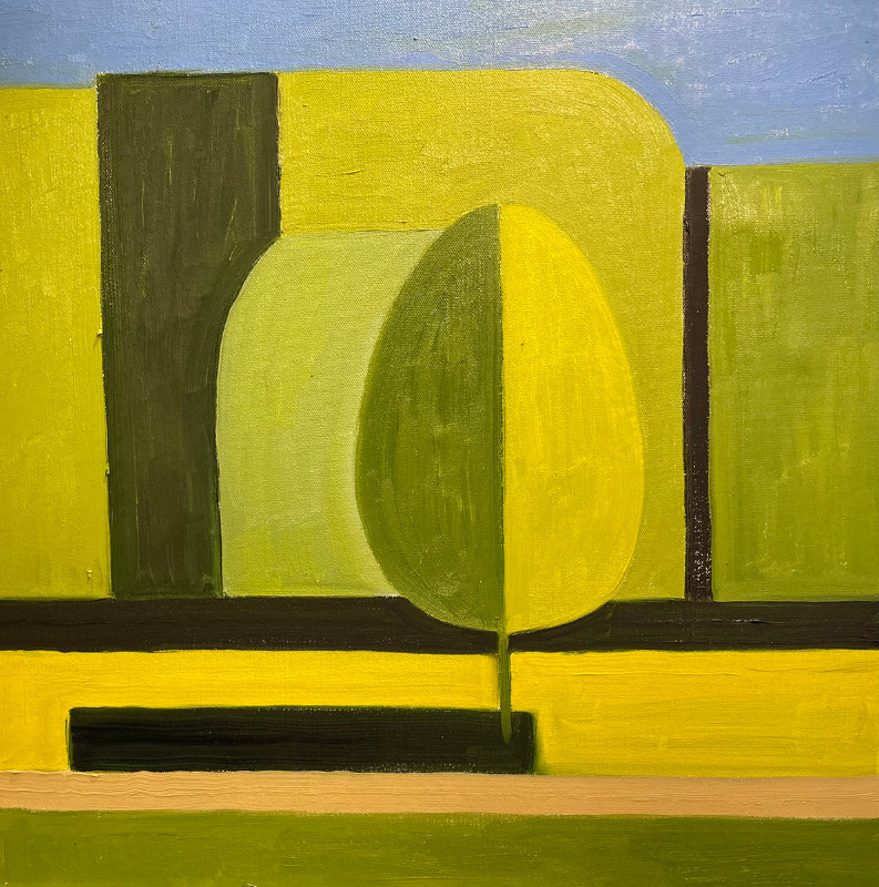
One Tree Shadow, 20×20
Three Trees in Fall, 20×20 inches, oil
Pond Reflection #7, 36×36 inches, oil
LG: Do your shape and color decisions ever relate to your previous set design work?
Adrianne Lobel: I have always been a “Flattist.” When I am dealing with theater, I use flat planes to carve up the space. It is the same in painting–where the canvas becomes “the space.”
LG: What might you say about the color harmony in your paintings? Would you say that you work more intuitively, or do you have a particular color theory or process you respond to?
Adrianne Lobel: I have no color theory–and I don’t understand color theory. My colors are all observed from nature. I often push them slightly–like that impossible spring green becomes bright yellow in my work.
Two Trees and a Bush in Fall, 20×20 inches, oil
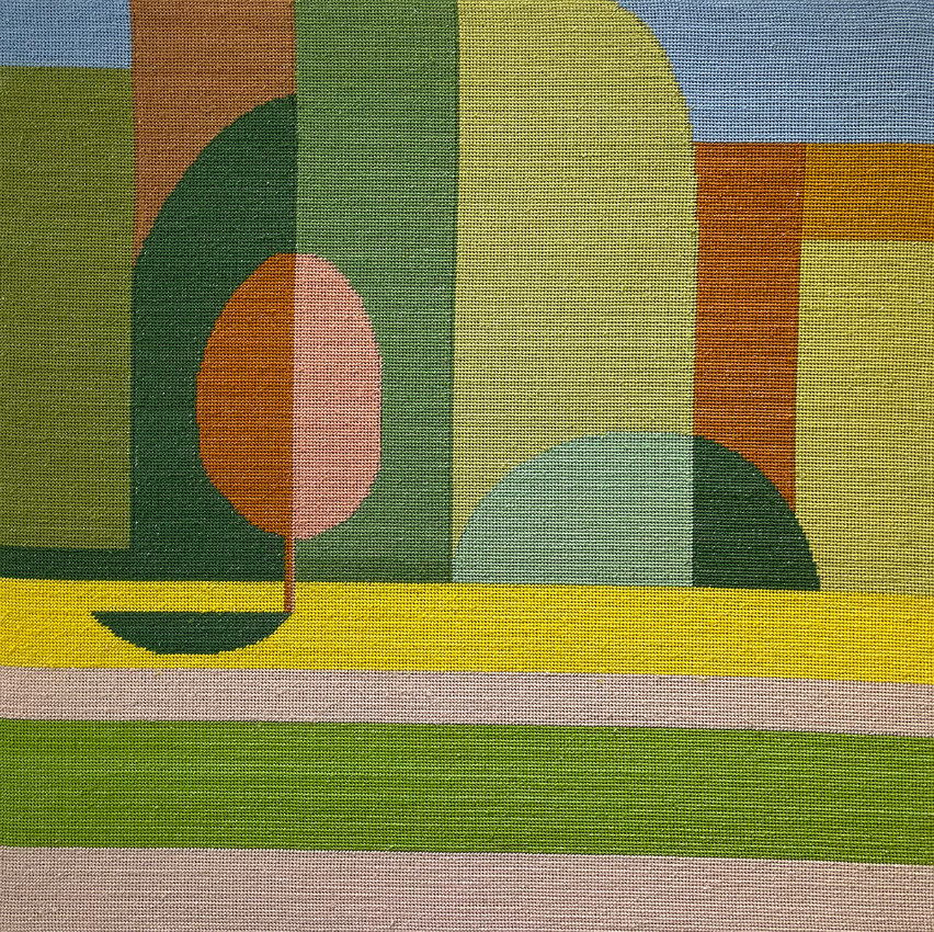
Slice of Sky, 36×36, oil
LG: The geometry in these new square paintings is remarkable because the flat shapes don’t break the picture plane, yet they suggest forms in front and behind each other in a shallow space. The intervals of certain shapes and their scale relationships break the symmetry in novel ways. What might you be able to say about what goes into your thinking about geometry?
Adrianne Lobel: I love geometry. It was the only math in high school that I was able to excel in. But it is all a question of translation. I make the shapes that I see and the relationships between the shapes that I see. It kind of paints itself. There is no theory. And half the work I do, I toss. They don’t always come together. It is thrilling when they do.
LG: Do you try to achieve a feeling of light or air in your painting?
Adrianne Lobel: I hope that that happens automatically, but yes.
LG: I understand you often use a tractor of sorts to drive all your gear out to paint in the field. Please tell us something about how you go about painting outside.
Adrianne Lobel: I have a green John Deer two-by-four vehicle that I load up with paints, a French easel (the wide kind), throw-away palettes, turpenoid, linseed oil, a palette knife, paper towels, garbage bags, brushes, hat, sunscreen, bug spray, water, and, of course, canvases. If I forget anything, I am lost and have to return home. Then I drive around a bit till I find a spot that calls out to me. I can paint from the same spot many times–an inch or two to the left or right changes the composition completely!
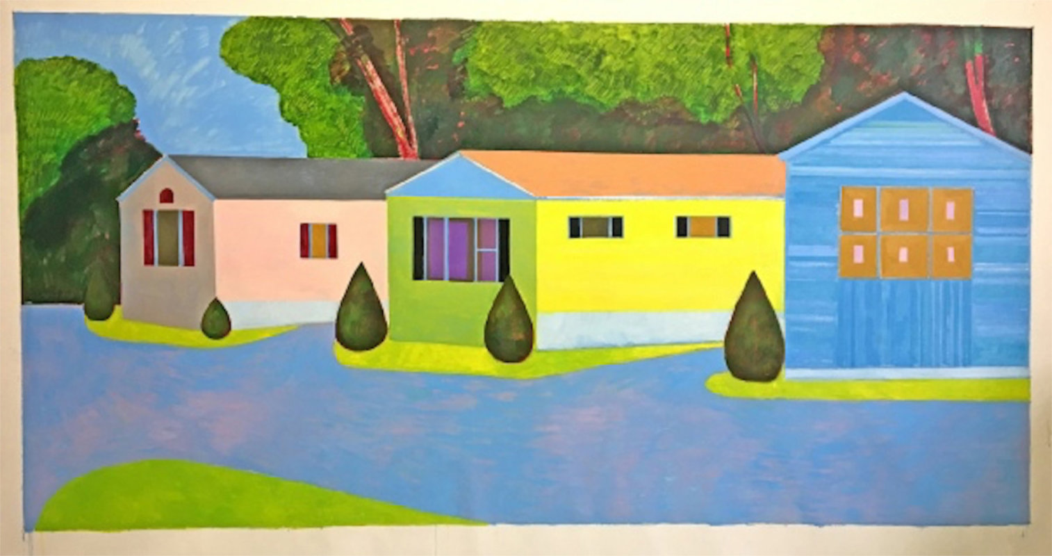
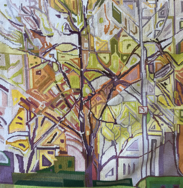
Mobile home, 6×12 Feet, Oil on Linen
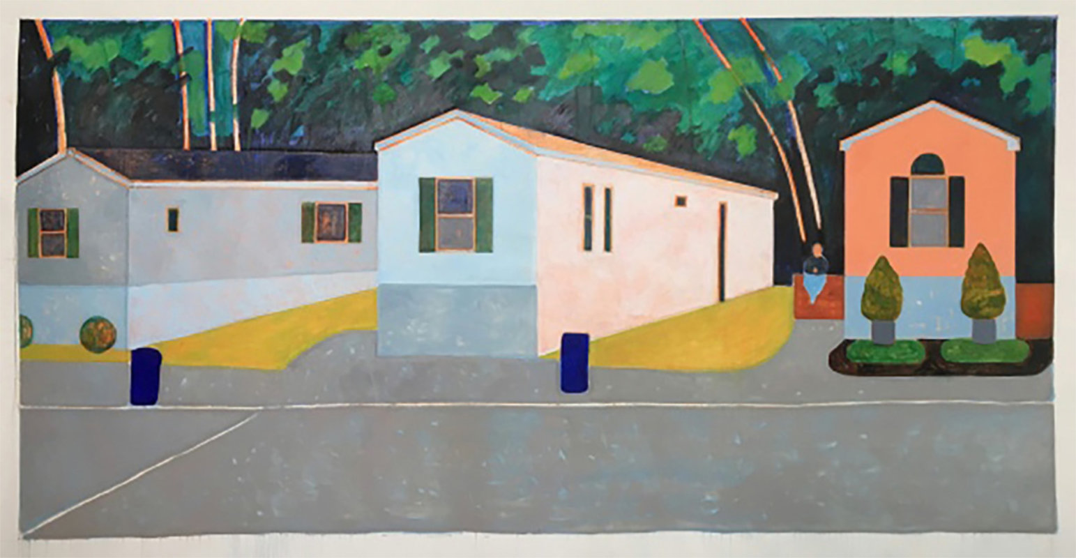
Mobile home2, 6×12 Feet, Oil on Linen
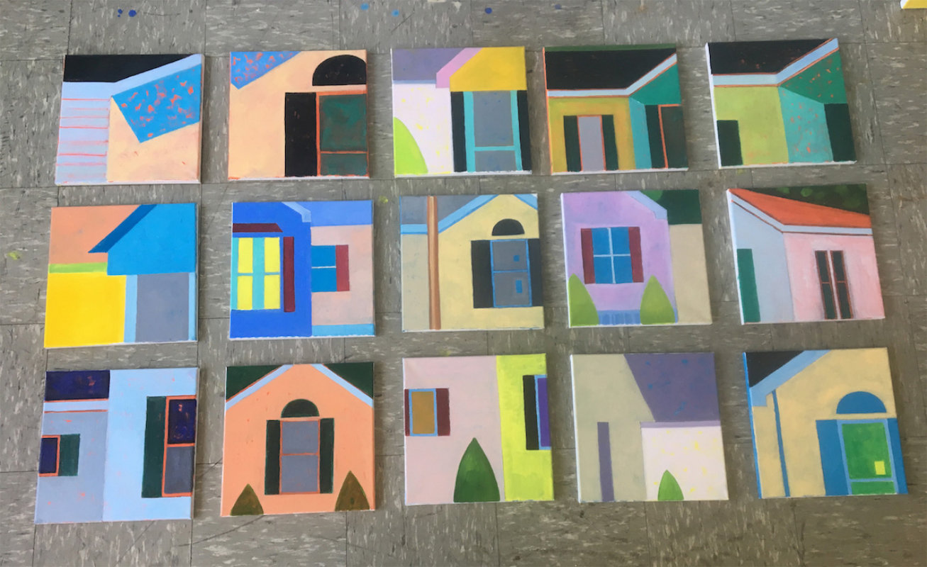
Mobile homes, 15 small
LG: What are your thoughts about visually translating so graphically your response to a subject like your trucks or mobile home parks? What is the appeal for you to paint more abstractly rather than a more naturalistic approach?
Adrianne Lobel: I feel like my evolution most closely resembles that of Mondrian. When I started painting, it was in a pseudo-impressionistic style. But as I kept on, the work became more and more angular and cubist. This recent work is the most boiled down to simple abstraction and feels the most genuine to me.
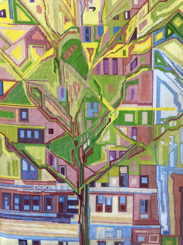
Cathedral Tree, 36×36 inches, 2007
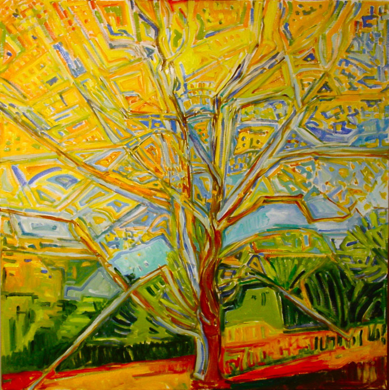
Glory Tree, 36×36 inches, 2007
LG: What are some of your decisions behind wanting to paint plein air along with your studio work? What sizes are your plein air work? Do you consider them mainly as studies or finished works in their own right? What information do you get from them?
Adrianne Lobel: I really can’t make anything up. I have no imagination, and I don’t understand how the abstract expressionists emoted all over the canvas. My work is completely based on what I observe. When I work outside, it is hard to go bigger than 36 by 36 inches. I normally do one small painting (around 20 by 20 inches) and then a bigger one in a morning. These paintings, when they are successful, become models for the studio paintings, which are often bigger and cleaner. The studio paintings are the ones that I show. I keep the plein air painting for making copies and to design my tapestrys from them. When I blow them up in the studio, I take the color and the relationships very seriously, and I try not to deviate too much.
Dancing Tree, 20×20 inches, oil
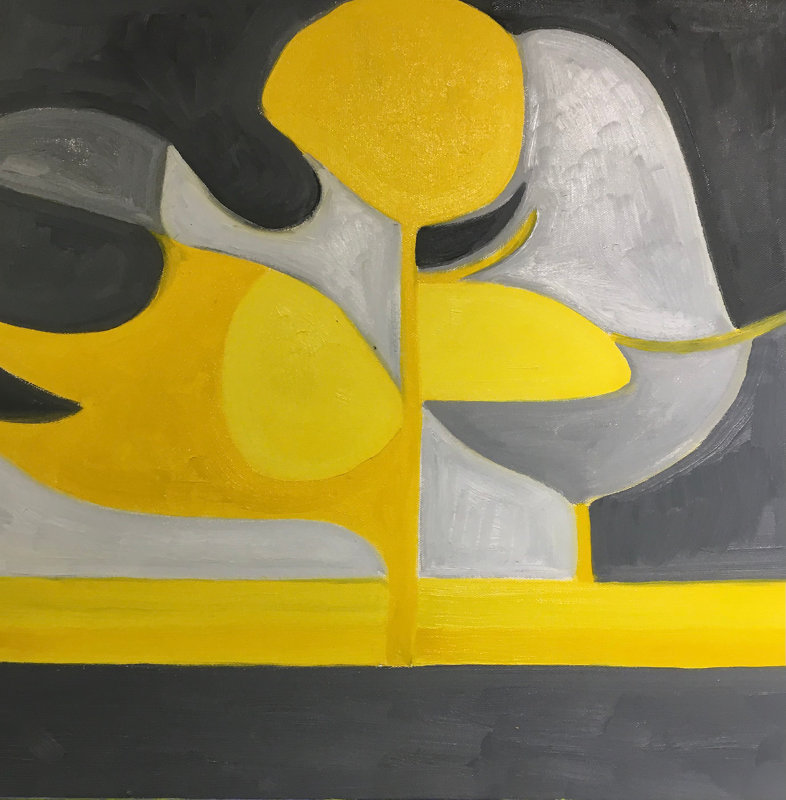
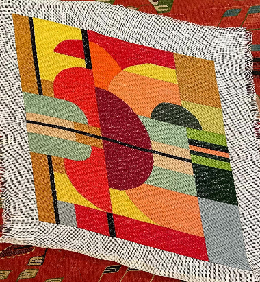
Needlepoint, 20×20 inches, Tapestry
LG: It’s unusual to see an artist making tapestries along with paintings; how did this come about? Can you explain your process for making these tapestries? How long does it take you to make one of these works? Were there any particular inspirations that led to your making this tapestry work?
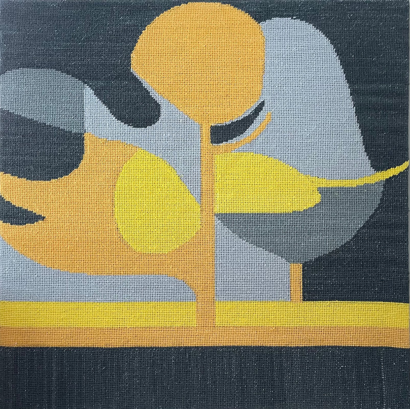
Adrianne Lobel: The tapestry work is insane. They take about 6 weeks to do. They are mostly 20 by 20 or 24 by 24. I take a painting and place the embroidery mesh on top of it and trace the design with a sharpie. Then I take the painting to Michael’s or Joann’s craft shop, where they have embroidery thread, and I spend hours matching the colors as best as I can. I tend to embroider in the evening in front of the television. I watch a lot of junk and it has to be in English because I can’t read subtitles while I embroider. I love the way they take the paintings to an even more graphic and pixelated form. People love them.
C.P.W. Summer, 20×20 inches, Tapestry
C.P.W., 23×23 inches, Tapestry
Needlepoint, 24×24 inches, Tapestry
LG: Can you tell us a few contemporary artists’ works you most enjoy seeing?
Adrianne Lobel: I love looking at art, and I think all great art is contemporary–like the Fra Angelicos in San Marco, Florence look like they were painted yesterday. But when it comes to painters working recently–I would say I have been most influenced by people like Sonia Delaunay, Sophie Tauber Arp, Calder, Noguchi, Diebenkorn, Thiebaud, and Hopper.
LG: What art books are you most likely to have close by in your studio?
Adrianne Lobel: I have hundreds of art books, but I confess, I don’t look at them often. I keep them as mementos of shows I have seen and loved. I like having my “friends” around me, but I prefer to see things in the flesh. I have spent my life looking very hard at everybody!
The post Interview with Adrianne Lobel appeared first on Painting Perceptions.